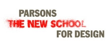
i do really kind of like the identity too. how's that for not being locked into anything? i think it's fresh for a school that is constantly redefining who it is, and it's kind of edgy which is nice. where i don't think it is as successful is on the actual pages, where it is used small. when knocked out of a color it loses some of it's impact. but i'm surprised by how it looks on the outside of the school on project runway. it almost looks like just a simple sans serif treatment. i think i need a field trip to see it in person.
2 comments:
i do really kind of like the identity too. how's that for not being locked into anything? i think it's fresh for a school that is constantly redefining who it is, and it's kind of edgy which is nice. where i don't think it is as successful is on the actual pages, where it is used small. when knocked out of a color it loses some of it's impact. but i'm surprised by how it looks on the outside of the school on project runway. it almost looks like just a simple sans serif treatment. i think i need a field trip to see it in person.
or tomorrow? where's my suitcase?
Post a Comment