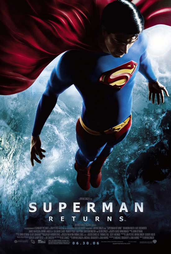
if you insisted on this configuration and wanted to use a sans then why didn't you use the sans that all of designers love, gotham. please note, it does not have a fugly 'R' like what was used in the poster.

then again, it is the hollywood way to try to ruin anything visual they can. to be nice i do like the image quite a bit. just not the type. i guess when you don't want to hire designers with experience dealing with type that's what you get. damn artsy designers, always criticizing.
1 comment:
saw superman again when i was home. i have to note that all of the title sequence is set in gotham. goodie on them.
Post a Comment