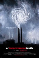
[ keynote and an inconvenient truth ]
at first i thought that al was quite a crafty guy. politician, advocate, graphic designer. i believed that maybe someone had developed some templates for him or something and so he was able to use those to build his presentation. but then it hit me like a ton of bricks when i saw his use of hanging punctuation. how could gore know about hanging punctuation when most designers don't even use them? from that point on i became more and more agitated. every time they showed a shot of him dragging little frames around it made me hostile, to the point i could no longer enjoy the movie. in the credits buck in la is listed as doing the presentation for the film, and there are many resources on these internets that talk about their contribution to the film.
[ buck la ]
(they also did those cingular commercials that to me look like the walmart smiley face ads).
i can't understand why this was basically hidden, or disguised in the film. maybe i'm over-analyzing, and the majority of the viewing public probably didn't give two shits about who created the visuals. they probably didn't know that mr. gore did not, but i did. damn it. i guess he also created the poster while he was at it.

an inconvenient truth you say? yes, clearly.
No comments:
Post a Comment