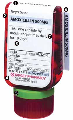
i have to admit, that when it was time to get a prescription refilled i thought of the new bottle and decided to venture off to my closest target. not only did it mean that i could spend a few minutes viewing all of the good stuff at the 'get, but i was also very interested in seeing the bottle live and in-person. imagine the joy i got when i discovered i could pick a color-coded cap to my preference! oh, the fun!
i think the form of the bottle is very nice, but it does seem a bit like a novelty, something to make it stand apart from the other ugly bottles perhaps. i do not think functionally it makes a drastic impact on the use of the bottle (watch for letters from industrial designers). The type is clean and neutral, perhaps frutiger (which i actually now despise). personally, i would have opted for something swiss and ultra-sans in style, but then again i wasn't asked. there does seem to be a large variety of type sizes, and i think it could have been as effectively differentiated by using bold vs. light, italic, etc. an abbreviated patient information form gets folded and tucked into the back label of the bottle, and it is a little difficult to remove. i can't imagine the pharmacists enjoy folding it and sticking it in the small pouch between the bottle and the label. perhaps there is some sort of easy way for them to do it. overall, i have to give credit where credit is due, so thank you designer for thinking outside of the box. now, if you can redesign the prescription bag and use a better weight of paper, and less pink. it's not the most attractive thing ever and slightly tarnishes the work done in the redesign.
target meds get a new look
No comments:
Post a Comment