before:

after:
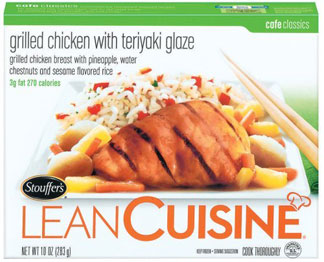
personally, i love my lowercase letters - lowercase for one, lowercase for all - so i do appreciate the lowercase sans used in the bottom version more so than the five typefaces used in the original version. i have to say i am very impressed with this packaging that has actually been out for about half a year, but is just now making it into my thoughts after a trip to the grocery store. i like the minimalist style, and the product shots sure are purty. unfortunately they had to use the stouffer's logo and the very, very, very strange little chef's hat. i also don't completely seem to understand the extraordinary large c, which towers over the other letters. if they just would have kept it at a consistent size with adding some kerning and getting rid of that chef's hat all might have been good. well, that and working on some alignment issues. what is the lean cuisine aligning with? it's teetering precariously just waiting to fall off the box.
actually, the lean cuisine repackaging reminds me a lot of the new target generic varieties of items. i wonder who is copying off of whom?
No comments:
Post a Comment