round 2
round 3
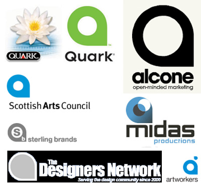
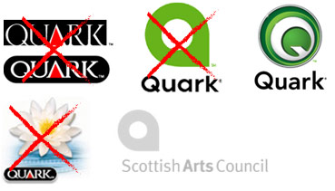
i've noted it before but tonight while i was searching for some quark tips i realized that they have changed their logo yet again. this gives them a solid year of two new identities and a revised "new" logo. nice.
i don't understand why they are even wasting their money, quark has seen it's last upgrade from many pro's. and why the hell can't i still see what my images look like??
[ drama! ]
4 comments:
I get a sort of sick pleasure out of seeing worthless POS companies flounder after years of monopolistic consumer torturing.
Quarks newest logo isn't horrible. It's at least better than the last photoshop-intense version. But you're right, it doesn't even matter. It just makes their inevitable demise more fun to watch.
The sad part of it is, there are still large design firms out there stuck using Quark. Years of selling out thousands for corporate upgrades and training have trapped them. Quark will still be around feeding off of this for a few more years, but by then it will be too late for them.
Then Adobe-Macromedia will officially own the whole of graphic design the world over.
if they wanted to throw away some cabbage i should have gotten in on that deal.
it's interesting that they completely threw away the type too. the type wasn't the problem but i guess they just wanted to distance themselves from the entire situation.
funny, but now i read it as quack.
Post a Comment