Sunday, May 28, 2006

big blue

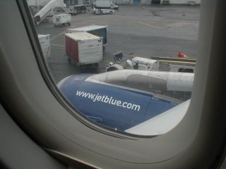
when you spend five and a half hours sitting on a plane entertained solely by the brand in front of you, you tend to become somewhat critical. though i really appreciate jetBlue's approach towards interesting design, their name appeared no less than four different ways. JetBlue, jetBlue, jetBLUE, jetblue. i'm not sure how this happened exactly, but someone definitely took some liberties along the way. the worst offense is a large glass partition in the front of the plane that has a small 'jet' and a visually huge 'Blue' beside it. i wish i would have taken my camera because the offense was so clearly spotted. you'll have to take my word.

i do have to say the tail variations are a nice systems project.


what has boa gone and dided?

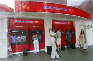
i saw one bank of america sign and i said to myself, that has to be a huge mistake a vendor made on a sign. but then i saw two, and three, and then ten. what i always liked about boa was that their logo was simple, clean, and well-implemented. their materials were of course corporate, but they believed in lots of white space and strong, simple design. but now, oh dear. what has happened here? the contrast in colors is nearly blinding when you see a building live in person. i can't decide if what they did was a result of the client demanding it, or the designers just wanted to completely destroy the visual integrity. maybe i'm being too harsh, but check it out.

nice


oh noes


dq on the move

dairy queen has a new logo. i couldn't find it online, but it shares the oblong shape with an added top swoosh and bottom swoosh for maximum swooshiness. and they've gone all acronym'ish with the use of 'dq'.

new

?

old


oldest

if edward tufte made a video


royksopp, remind me

Wednesday, May 17, 2006

communication skills 101

update: just received this email. so wait, someone is actually reading my blog? i never thought that it was true that anyone read my little meaningless blog. this helps to clarify their mo and i will say that now that i understand what they are doing it makes more sense. how 'bout a little blurb on your site? even 3 pt type would be great. actually it would be a lot funnier in 3pt type.

> Visual Narcotics:20mg is a street art project primarily started as a
> response to the massive amount of advertising overtaking "public"
> space. The name "Visual Narcotics" refers to the bombardment of
> images directed towards us by advertisers through the mass media.
> Just like a drug, these images are intended to make us feel and act a
> certain way. The "Pill" and the use of the common dosage "20mg" is an
> icon used to represent and remind us of our self medicating consumer
> based society. The project's goal is to raise awareness to the
> conventional mass media's "narcotic" mind control and to question the
> influence of this media saturated environment. Not to be angry at it.
> And also not to put up pictures of dead wrestlers everywhere. We
> don't have any long rants on the site because we think our intentions
> are pretty self explanatory. Thanks for your interest.
>
> 20mg


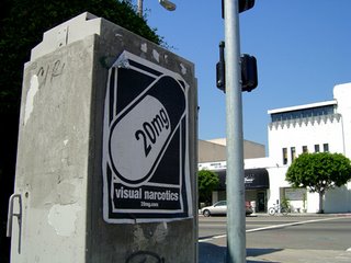
does dissent with the world and media really work if you have no message? i spotted one of these large poster/stickers on my way to work today. it made me interested in what the meaning was so i decided to do a little research and stumbled across their site:

who are you? what is your purpose?

however, shouldn't you maybe make a statement about what you are doing? i would be happy with just a paragraph, but no, nothing. not even a nice hello. it's fine if you want to be angry at the world, but at least be effective in your communication.

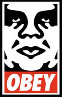
what about obey giant? this has created quite a movement which is obvious since you are copying it. but if you are going to copy the idea you can take a note from his campaign and the clear messaging behind what he is doing.


obey giant

Monday, May 15, 2006

meh(2)


i guess it's supposed to be ironic in some way? how many ways can you copy an idea before it explodes?


Wednesday, May 10, 2006

is cheap logo design killing our profession?


oh sweet vertical type, going the wrong direction on top of everything else


if it is completely illegible, does it still count as design?


if you are registered anywhere as a designer you have probably received one of the millions of emails promising great, quality logo design for pennies. i guess in some ways it is good that people are actually investing some interest in trusting a designer to create a logo instead of doing their own in word, but is it removing the value of quality design? can the general public really tell the difference between good logo design and bad logo design? do they know an original rand from an original kinko's?

personally, i have written some of these companies pretending to be an interested client, but i've never received any response. they must be on to me. probably because i have also sent them hate mail about how they are discrediting our profession. oh wait, i just let my opinion out. of course if it can be cranked out in three days then hopefully someone will understand the quality of what they are getting.


Total US$595 ($295 up front)
Unlimited designs, changes & colors
Logo ready in 3 days
All widely-used formats for any purpose
Copyright transfer

Total US$795 ($395 up front)
Custom Logo
Letterhead
Business card
Envelope

Total US$2195 ($1095 up front)
Custom Logo
Corporate Stationery Package
Corporate Website

Monday, May 08, 2006

the death-blow

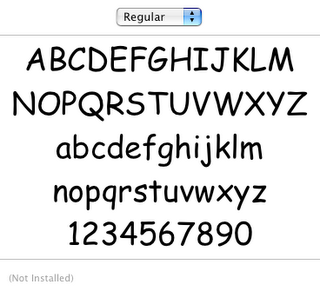
if you watched the apprentice tonight you might have picked up on something i did. the male team decided to convey their fun, participant-rich tailgate party with an original flyer created by the group of non-designers. now, it's perfectly fine that they are such experts at word that they were able to design their fancy charismatic flyer, however there was one thing they overlooked. in their attempt to add to the fun and enjoyable event the deadly mistake they made was... comic sans. yes, it wasn't about food sales, it wasn't about fun activities, it wasn't about drunken frat boys and bouncing cheerleaders, it came down to comic sans. finally the anti-comic sans gods are smiling down upon the earth and striking with deadly force against anyone who dares to use the font. take this as a lesson, you never know when the acsg's are going to strike again.


death comes in 52 flavors plus numerals.

http://bancomicsans.com/

the death of the cingular man : (


this is so sad. it was one of my favorite brands for a spell, maybe because vsa did it... but it doesn't matter because he is now dead.


AT&T Plans to Kill Cingular Brand
But Some See Change of 'Cingular' to 'AT&T Wireless' as Mistake

By Alice Z. Cuneo

Published: May 02, 2006
SAN FRANCISCO (AdAge.com) -- It cost $4 billion to turn it into one of the best known names in the country, a future-forward, dynamic brand with a strong connection to young consumers and a share lead in the wireless marketplace. Yet, in 2007, Cingular will be tossed aside like an old sock.

Acquisition
Not only is AT&T -- in the throes of acquiring Cingular owner BellSouth --planning to ditch the Cingular name and ubiquitous, sprightly orange jack, but it will replace it with its own stodgy moniker, renaming the division AT&T Wireless. Such a move could conjure up images of the rotary dial and cause so much confusion that experts estimate it may take another $2 billion in marketing expenses to explain the changes to consumers.

AT&T argues that the $4 billion spent building Cingular -- it will lay out around $1 billion this year alone -- won't be wasted, because, in the words of spokesman Michael Coe, it has "created a brand that has led to a customer base which is the largest in the U.S." The company also claims that the single moniker for all AT&T services will "eliminate customer confusion and make a much more elegant solution."

And certainly if consumers take to the idea of bundled service, it is easy to see where "elegant solution" comes in. It would seem logical to try to sell consumers their landline, Internet connection, cable connection and wireless service all under the same brand.

'A mistake'
Still, many ad experts feel the success of bundling is far from a given, and that ditching the wireless brand as we enter a wireless future is the wrong approach. "To give up Cingular is a mistake," especially in favor of AT&T, "my father's brand of telephony," said Jonathan Asher, president, Dragon Rouge USA, a branding and design consultancy. "I'm not sure how much value or what AT&T brings to the party." Of course AT&T has positive attributes, Mr. Asher pointed out, like "incredible recognition, incredible heritage and somewhat reliable," but it also is "stodgy, old fashioned, big, heavy and dated."

Karl Barnhart, managing director, CoreBrand, New York, a former AT&T agency, agreed that changing the Cingular name "doesn't make sense." Cingular's brand is "relevant for the younger audience; it's a fun, hip, interesting, dynamic -- everything you don't think about AT&T."

Mr. Barnhart estimates the changeover will cost "probably one-half billion per year for three to five years." And in the end, consumers still may not understand why they moved from writing a monthly check to AT&T to writing one to Cingular and then going back to AT&T, he said.

'Could it cost them customers?'
"It's the right decision to buy BellSouth," said Mr. Barnhart. "But it's a hard business decision to jettison Cingular." Could it cost them customers? "If they don't do a good job of [changing the Cingular name] consumers will jump to Verizon Wireless."

The change also comes at a time Cingular faces a flurry of emerging competition targeting the lucrative youth market from new wireless service providers such as Amp'd Mobile, Mobile ESPN and other mobile virtual network operators.

Cingular is the No. 9 mobile brand in the world, according to Millward Brown's recent global brand rankings, and has a value of $6.6 billion, just below Verizon Wireless at No. 6 and T-Mobile at No. 7. But Nikhil Gharekhan, senior VP, Millward Brown Optimor, still thinks it makes sense to hitch the wireless arm of the newly merged company to AT&T's star, or death star, as some describe its logo. Brand equity "is not wasted if there is enough marketing or communications of message so those equities are transferred to AT&T."

'Somewhat damaged' AT&T brand
Susan Nelson, executive director strategy and insight at Landor, San Francisco, also espoused the view that the "somewhat damaged" and increasingly meaningless AT&T brand needs to be attached to the Cingular business for the entire company's sake. "Rebranding Cingular is not only the right thing, but probably the only thing to do," she said. "The AT&T brand didn't stand for much ... at least as a leader in telecom. If they want to make it meaningful for tomorrow it has to represent the state of the art, and the state of the art is mobile."

So far experts have been unimpressed with AT&T's $1 billion-plus campaign last winter to introduce the combination of SBC and AT&T. "It's an amateurish revision," said Mr. Asher.

The head of one wireless company joked that AT&T is spending a lot of money for virtually the same logo and a lot of lower case letters.
fun with pictograms


many, many more signs